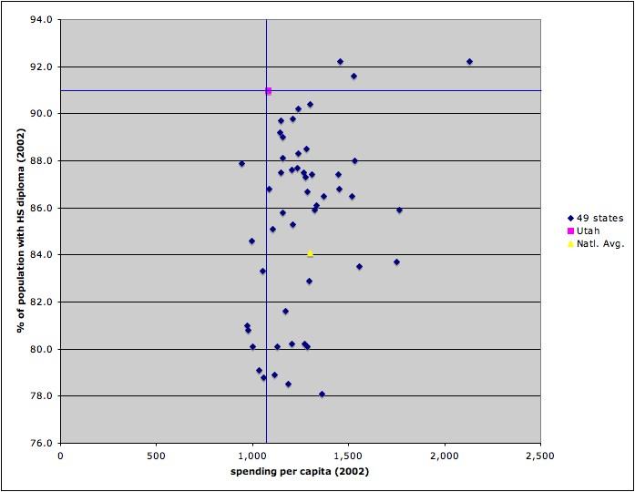
The graph is divided into four regions based on a comparision with Utah. States in the top left region are states that spend less per capita on education than Utah but get more graduates. There are none. States in the top right regin are states that spend more and get more graduates. Those states are, interestingly enough, Alaska, Wyoming and Minnesota. States in the bottom right region spend more on education than Utah but have a smaller percentage of HS diploma holders. This includes most of the states and includes the national average. And states in the bottom left quadrant spend less on education and have fewer HS diploma holders.
Caveat: I am not argueing for less or even the same amount of spending in Utah. I would like to see more money spent on education. The data do suggest however that we are getting the most bang for our education buck, by far. Also, the percentage of the population with a HS diploma may not be the best measure of educational success.
1 comment:
Hey this is Ken from Oblogatory Anecdotes. I am unemployed right now and am looking for a job. If you know of anyone who is hiring around the Wasatch Front please let me know.
Post a Comment